‘Bar Rescue’ host Jon Taffer argues Cracker Barrel leadership should be ‘disempowered’ after rebrand disaster on ‘Varney & Co.’
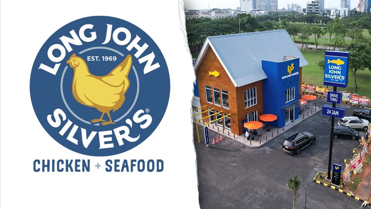
Fast-food chain Long John Silver’s has unveiled a redesigned logo that replaces its signature fish design with a chicken as part of a larger effort to showcase its versatility and “spark conversation.”
The refreshed branding, introduced Oct. 3 across digital platforms, also features a new tagline of “CHICKEN + SEAFOOD,” according to a news release from the company.
“Guests have been telling us for years that our chicken is a best-kept secret,” Christopher Caudill, senior vice president of marketing and innovation at Long John Silver’s, said in a statement. “Our hand-battered chicken strips — known as Chicken Planks — are every bit as crave-worthy as our legendary fish. It’s time we let that secret out.”