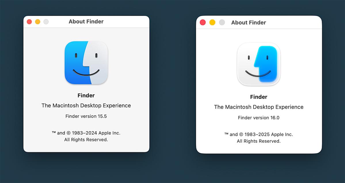
The more things change, the more they stay the same. After unveiling some new visual elements to the next generation of its operating systems during WWDC 2025, Apple has already walked back some of the proposed design revisions. 9to5Mac noticed that the most recent developer betas included changes to the new Liquid Glass operating system appearance and to the Finder app icon.
Liquid Glass was . The idea of layering transparency in the user interface appealed to some, while others felt it was needlessly fussy and hard to read, especially when using the Control Center. In the of iOS 26, Apple has increased the darkness and blur on the background when the Control Center is active.
The other controversial change centered on the imagery for the Finder app in macOS Tahoe. The previous developer beta flipped the colors in the icon, putting blue on the right and white on the left. It’s a…